This is when someone argues that if you allow A to happen, then B, C, D, and eventually Z will follow like some kind of unstoppable chain reaction. The conclusion is usually exaggerated to scare you out of making that first move.
I've seen this plenty in IT consulting.
You recommend a small change, like adding one more user role to the security model. Then someone pushes back with, if we add that, the next thing you know everyone will want custom roles, and then we'll need a full-blown identity server, and eventually, no one will be able to log in. All because we gave the receptionist read-only access to one extra report.
Same thing with work-from-home policies. You suggest letting employees work remotely one day a week, and someone immediately responds with, well if we allow that, soon nobody will come into the office, collaboration will collapse, and the company will fall apart. Classic slippery slope. No discussion about the in-between. Just straight to corporate doomsday.
Even with serious topics like national security, the slope gets slick. You start with, let's hold certain suspects without trial. Then someone suggests expanding that to anyone labeled a threat. Next thing you know, the government is silently disappearing citizens, and critics are being locked up for asking questions. Yes, some of this has happened in real life. But when someone leaps from a single exception to a full-blown police state overnight, that is where the fallacy kicks in. It's not that the concern is invalid. It's that the leap skips over every step in between.
There's a great Star Trek version of this in the TNG episode The Drumhead*. Admiral Satie starts with a legit investigation into a security breach. But before long, she's accusing loyal officers of conspiracy with zero evidence. Her thinking is pure slippery slope. If we don't root out every possible threat right now, the entire Federation will fall. It's fear-based logic that justifies wrecking the system to save it.
The slippery slope fallacy works because it preys on emotion, especially fear. But in both consulting and life, you have to stop and ask if the disaster being predicted actually follows from the first step. Not every decision leads off a cliff. Sometimes it's just a checkbox on a form.
Hmmm. It is difficult to discuss this point without going into (political) specifics, but I could cite quite a few Supreme Court decisions that were slippery slopes that have indeed brought about disastrous consequences. Maybe it's safe to cite one from the past: In 1896 SCROTUS ruled in Plessy v Ferguson that racial segregation was ok ("separate but equal").
Maybe that's too grand a stage and should have different rules than day-to-day decisions. Back when I helped design/configure the electronic medical record, we did have to draw lines on how much to include. There were MANY "me too" folks who all wanted their special fields and we could not say yes to all of them. To me the interesting question is "where do you draw the lines?" Is there a certain percentage of people who get what they want? If I have a pie shop, should I be making pies for the 1% of people who like rhubarb? The 5% who like lemon meringue? Or do we rule by fiat, a la Henry Ford (c.f. black Model T).
Good points. When it comes to SCOTUS decisions, look no further than Citizens United. Corporations are people too, and can now spend unlimited amounts of money on political contributions. The beginning of the end...
Thomas Gonder
@Reply 13 months ago
The next image kinda pertains to this, as well as WTH (what the hell) kinda design is this?
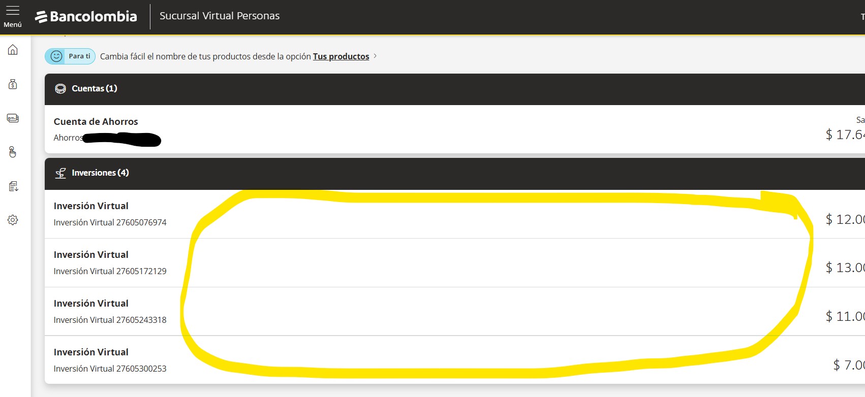
Today I opened my bank's web page in Colombia. The redid their web site, for what reason I have no idea, as the old one worked fine.
The slippery slope? Tell a designer you want more "white space" on the pages! Before, in all that white space was useful information about my investments.
Looks like they were trying to redo their website to be more mobile-friendly. A lot of sites are doing that now, and that ends up basically stretching everything on a desktop monitor, which I think is stupid.
Have they not heard of responsive media queries, just lazy
Thomas Gonder
@Reply 13 months ago
Richard Look at what Microsoft is doing with configuration!
And they want to get rid of Control Panel.
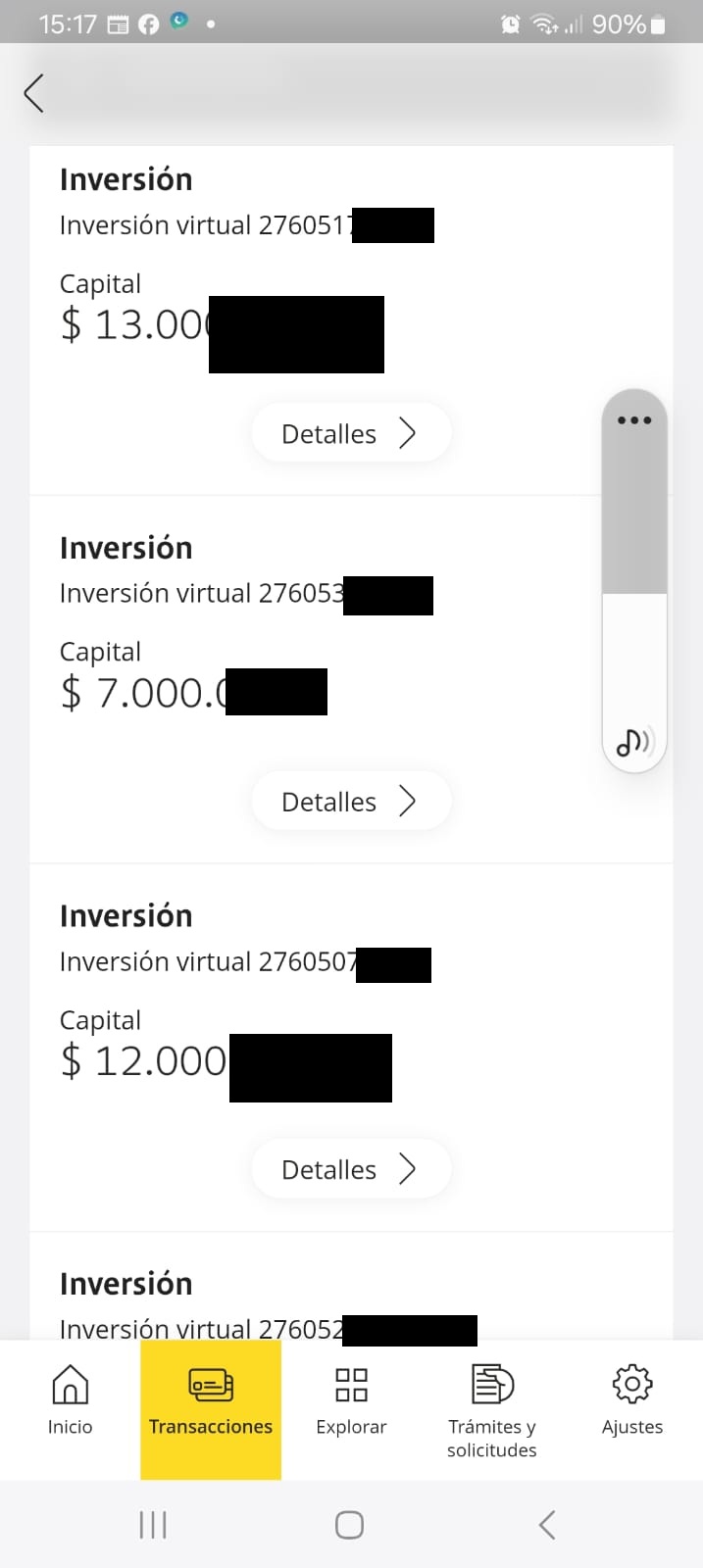
The bank has an app, which they are pushing more and more, and until now I thought they were neglecting the web site, which I wish they had of.
Even on the app, there is too much wasted white space. How about showing me the begin and end date of the investment, along with the interest rate and interest to be earned. They take another whole page under details to show that information.
They walk among us.
Thomas Gonder
@Reply 13 months ago
Thomas Gonder
@Reply 13 months ago
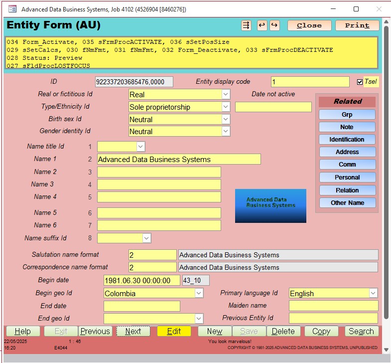
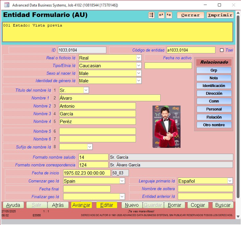
After complaining, I'm feeling a bit self-conscious about my form designs. I've put dozens of images in threads about other topics, and either people are too busy or too kind to comment. So, I'll ask here. Does the form below seem to strike a nice balance, in your opinion, between too little and too much crammed in a given space?
(Keep in mind, that labels for entry controls may have text that is much longer than when in English.)
The alignment of the labels is a little off.
Personally I'm not a fan of the colours but I know they are changeable
I'd probably keep everything the same font.
Not sure the developer stuff is needed for the everyday user so maybe have that hidden or collapsed by default
Thomas Gonder
@Reply 13 months ago
Alex Thanks for sharing your 2 cents (can't do the symbol here I don't think).
The labels should be aligned to center for each section, I'll double check.
There are supposedly millions of colors, but when I look at the web page for them, 90% all appear so close to the same for the primary colors, to my eyes anyways.
It should all be the same font (italic for labels that translate), with the exception of the status area, I'll double check.
Yes, the status area can be dumbed down for users, you're seeing the developer display. But it can be turned on for a given user to see what they've been up to that causes some kind of error. Users always get basic messages there.
How's the spacing and clutter to your eyes? Sometimes there is a bit more "white space" than I would like, it's just a matter of nothing else will fit there.
Thomas Gonder
@Reply 13 months ago
Michael My grandmother made us rhubarb pies when we visited. I have no idea what it was, and I'll die happy never having another bite of one.
I'm personally not a fan of centered labels. I like everything either left aligned or right aligned, including the text boxes. I like to have them all in a nice neat column, but that's just me. That's just my preference. It looks like a very functional form.
Sam Domino
@Reply 13 months ago
Michael My "favorite" example is the federal income tax. It was taunted as only pertaining to the very rich and would be limited to 1%. Now look were we are with it!
Richard Agreed! That was a bad decision by the SCOTUS. I've always argued that only citizens in the politicians should be able to donate and that the donation should be limited to $100. Unfortunately, when it comes to LARGE sums of money, once the cat is out of the bag its almost impossible to get them back in the bag.
Thomas Personally, I like data dense forms. I also prefer right-aligned labels; and muted colors (except for "red alert" notifications)!
Sam I've always said get rid of the income tax altogether and replace it with consumption-based taxes. Therefore, people aren't penalized based on the amount of money they make, but based on the amount of money they spend. So if you're lower-income and you're hurting and you're pinching pennies, you're not going to lose any of the money you earn paying taxes. And the rich people are still going to buy rich people stuff.
Yes, I agree with you on donations. It should be one voice, one vote, one $100 bill. And a true democracy that's how it should be run. Or we just get rid of money in politics altogether. But that's a argument for another day. That'll never happen in this country.
Sam Domino
@Reply 13 months ago
Ooops! I left out the word "district" as in the "candidate's district". CII < 5 strikes again! LOL!!! :-(
Kevin You are welcome to all my pieces of rhubarb pie. Happily.
Thomas Gonder
@Reply 13 months ago
Richard Thanks for commenting on the form. At one point I had justification being set as an option. I broke it. I'll get that back working in version 1_25
Sam I went with brighter colors for the "core" application modules, to make them stand out. For example, if you are an administrator or supervisor, and you walk past a desk with bright colored forms showing, your antennas should start quivering.
@all From my study many years ago on the idea that corporations are "individuals", that wasn't an actual SCOTUS decision. It was the interpretation of a court clerk that somehow stuck. Or it was all a giant CONSPIRACY to sneak it in for the richies.
Thomas Gonder
@Reply 13 months ago
Thomas Gonder
@Reply 13 months ago
BTW since we like history here, my dad, Budd Gonder, was a friend of Roy and Johnathan Winters, often having breakfast together at a restaurant in Summerland before two got sick (Jonathan wasn't physically sick, but he and Robin Williams both suffered from bipolar diagnoses, and the one time I attended one such breakfast, it was CRAZY!). Roy got a few pointers from my dad on how to be a "prickly" teacher for Fast Times at Ridgemont High, drawing upon his many years' experience as a history and math teacher in the public school system of California. Roy needed little help in acting prickly. But Roy used many of the scripted lines my dad's students heard for years.
When I was a young kid, I also suffered respiratory contamination while he and Walt Disney smoked a pack each and "uncle" Walt kept yanking the animatronic control for little birds (later used in the Tiki Room) out of my curious hands.
Thomas Gonder
@Reply 13 months ago
Sam Domino
@Reply 13 months ago
Thomas Maybe, one day, the SCOTUS will overturn that clerk's decision!
Thomas Gonder
@Reply 13 months ago
Sam Years ago, I went fairly deep down that rabbit hole when studying the issue of corporations being "real people". It makes no sense why the court hasn't rectified or retracted that clerk's headnote in almost 140 years. The court made no declaration or judgement on the issue, which was about taxes. The clerk, a Mr. Bancroft, just added it. Given the wealth of the railroad companies at the time, and growing industrial corporations, I'm fairly sure it wasn't as simple as a clerical error or oversight. Curios that Congress too, has sidestepped the issue for all these years.
If you study how the rich live, many survive off borrowed money, with their stock put up as collateral. Why pay politicians, with borrowed money that you don't pay taxes on, to do your bidding when your corporation can do it with a better tax break?
Senator Sanders has been ringing this bell for decades, and his reward? Getting called a commie.
Thomas Gonder
@Reply 13 months ago
Getting back to my first tangent on the slippery slope, it takes some good designing to provide just the right amount of information on computerized forms. Too much blah, blah around the entry control, and the user is overwhelmed. Too little and the user is asking WHAT DO YOU WANT HERE (damit, Janet!)? With the old dumb terminals, I was limited to putting more information on the 24th row of the screen, 79 characters at most. No pop-up windows. Now Access handles that by hovering on the label or in the bottom left at entry. For lots of blah, blah a help button or right click on the field works fantastic.
Thomas Gonder
@Reply 13 months ago
Thomas Gonder
@Reply 13 months ago
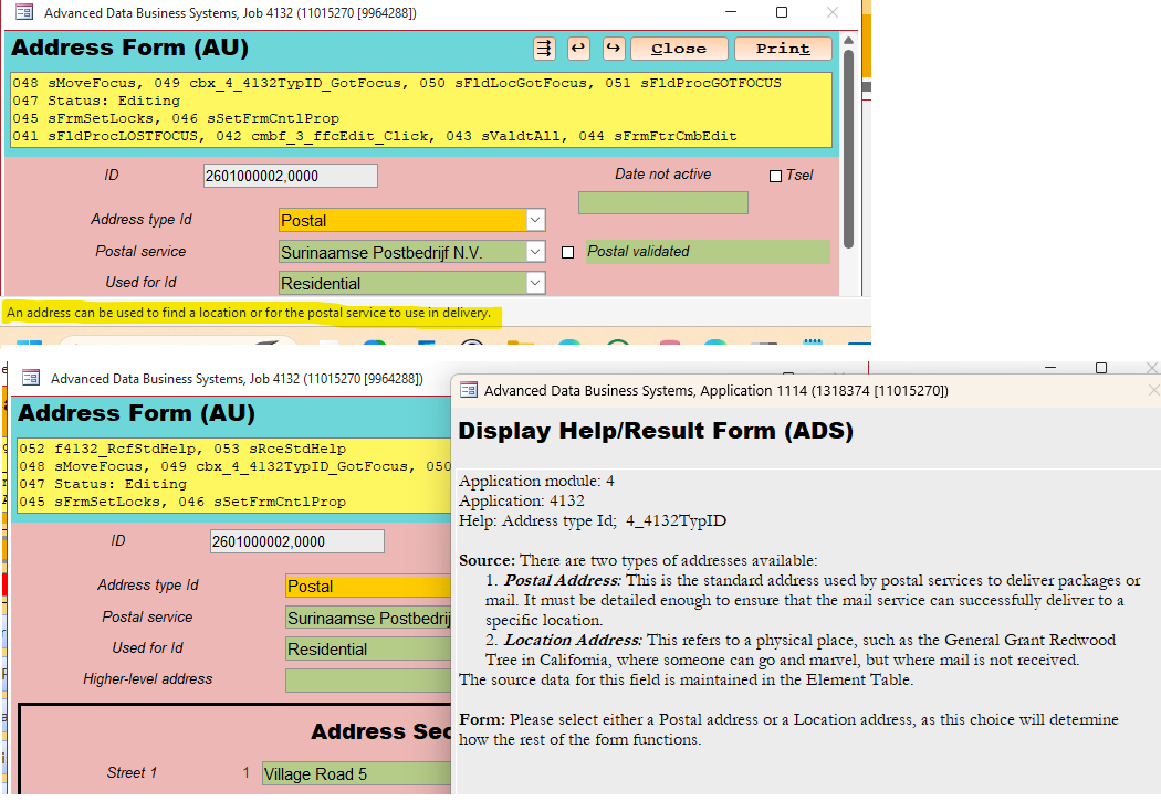
@All To those that mentioned the label alignment, here you go. Fixed. Now you can change the borders, colours, ital, and justification to your heart's content. This is just an exaggerated example. Notice the status area is very clean for regular users.
All this is controlled in tables, no form or VBA code needs modification. This is so it can be easily changed for a .accde user.
Richard Okay, I'll pay and thanks for the comment, but does the image help to explain what's going on here? I haven't seen a lot of big applications in Access, just those MS toy templates for the most part. I'm curious how this form stacks up against what people are used to in this decade for an organization. Remember, I'm porting some old/tested ideas and genuinely want to know. I've heard several complaints about the colors, and I've explained them. Then there was the prompt alignment, answered and enhanced.
I'm curious if people are actually looking and thinking, that looks interesting, haven't seen that before or I could sure use that data arrangement in my db. Then, I'm even more interested in the kinds of things (fields, buttons, etc.) that you think are missing that should be there.
The whole peanut gallery can chime in, not just Richard.
Thomas when I have some time, I will give your database a proper review and critique. I'm under a bit of a time crunch right now myself. I still don't have a video made for today. And I do have your email, I will get to it again as soon as I can. I have a whole folder in my inbox full of stuff that's not urgent, and of course: snooze, snooze, snooze. You're not alone; there's lots of them in there. But I am interested in checking it out completely and possibly even doing a video review for it. But it might not be any time soon because I've got a million things on my plate and there are never enough hours in the day.
But yeah, I couldn't look at those colors all day. LOL. But that's just a matter of style and taste. And if you have it customizable so that managers have one color set and users have a different, I understand that completely. You've seen the databases I build, I'm pretty bland with my color palettes. Simple blues, maybe a green or yellow here and there to bring something out. I try to avoid shades of red unless it's something urgent.
Thomas Gonder
@Reply 13 months ago
Richard No rush, it just keeps getting better and better. ha ha kinda like that Dad joke.
As for the colors, the idea is that each application module (sales, accounting, etc.) can have its own color scheme.
People used to call me to "see" something on their screen, and since it was pretty much monochrome, it always took me several seconds to get oriented as to where they were and what they were up to. Even though I wrote it all (easy to get lost after you've created hundreds or thousands of complex forms and reports). If users don't change the colors, I can quickly see, "Oh you're doing data administrator stuff, ok cool, now what?" It's such a joy to work with the colors and pop-up forms, along with ample space to put them all.
Matt Hall
@Reply 13 months ago
Thomas, you might check the vertical alignments. For example, sex and gender seem too close and name 4 and name 5 seem too far apart. Name 1 label is misaligned, horizontally. If you can match the name 1 field length to the rest of the name fields, you could enlarge the image, if you wanted.
Is there a need for the 1 through 8 labels in the name area? Are the name formats going to become combo boxes?
As to your original question, I don't think you have too much or too little info on that form. It looks pretty easy to see what is expected there. The changes that you have made to the alignment has made it more readable to me.
Thomas Gonder
@Reply 13 months ago
Matt Thanks Matt. The spacing logic goes like this, but I admit it's a bit difficult to implement precisely as I would like. Sex and gender are very related, so they go together closely. Name 3 & 4 are very common in Western nations, while 5 and 6 are not often used, even though they exist, in Eastern cultures. But they're there for family, friend or genealogy dbs. So, a little extra space to offset them.
As to the 1 through 8, yes, because #1 isn't strictly a name, while #2 is Name 1, so the user chooses the rows they wish to use in the name format fields below.
It looks like I need to fix the label for Name 1. It's very easy to accidently move a control when opening a form in design mode. This new feature for labels (in ver. 1_25) makes it easier to spot this for the developer. I would probably turn off the borders for users.
I'm glad you were able to decipher the Spanish translation of the form. :)
Sorry, only students may add comments.
Click here for more
information on how you can set up an account.
If you are a Visitor, go ahead and post your reply as a
new comment, and we'll move it here for you
once it's approved. Be sure to use the same name and email address.
This thread is now CLOSED. If you wish to comment, start a NEW discussion in
Captain's Log.