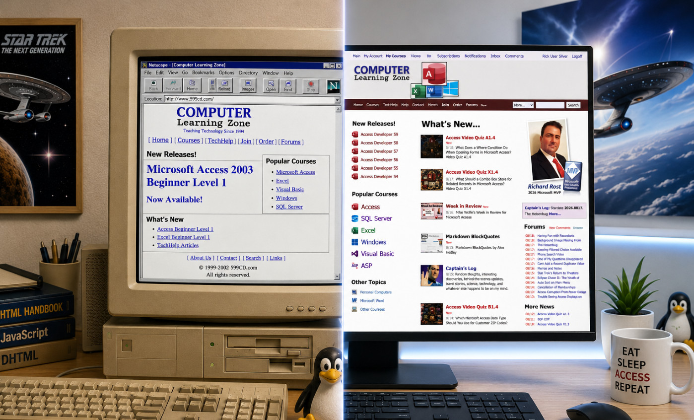
For years now, I've wanted to make the navigation bars on my website stay at the top of the screen while you scroll down the page. Seems simple enough, right? Well, you have to understand that I learned HTML, CSS, and JavaScript back when dinosaurs roamed the Earth, websites had visitor counters, and everyone was very excited about getting their screen resolution up to 800x600.
Back then, keeping part of a page permanently visible while the rest of it scrolled wasn't exactly easy or elegant. You could screw around with frames and framesets, which I did at various points over the years, but frames came with their own collection of headaches. They looked stupid, behaved differently depending on the browser, caused navigation problems, and eventually became especially awful once phones and tablets entered the picture.
So every few years I'd think, "I'd really like those navigation bars to stay at the top." Then I'd remember what was involved, decide I had better things to do with my life, and forget about it again for another couple of years.
My website doesn't exactly use cutting-edge layout technology, either. I started building this thing back in 2002, and a lot of the underlying structure is still based on HTML tables. That's how we did things back then. CSS layout was still something you read about in science fiction, and if your website looked good in both Internet Explorer and Netscape Navigator, you considered that a major technological achievement.
Over the years I've modernized tons of pieces of the site, but the basic structure works, and I'm a big believer in the old engineering principle of "if it ain't broke, don't spend three weeks rewriting it just because some 23-year-old on Reddit thinks your HTML is ugly." There are parts of this website that probably still remember the sound of a 56K modem connecting.
Today, however, I decided to ask ChatGPT. I basically said, "Look, I've got these navigation bars across the top of my website. Is there some relatively painless way to make them stay there while the user scrolls without re-plumbing the entire damn website?"
ChatGPT says, "Sure. Use position: sticky."
I'm sorry, what? Apparently while I was busy teaching Microsoft Access for the last couple of decades, CSS learned some new tricks.
We tried sticking it directly on one of my table rows first. Nope. My ancient table layout looked at modern CSS, grunted, and went back to listening to its dial-up modem. Then we tried position: fixed. That worked, but because fixed elements are removed from the normal page flow, everything underneath jumped around and required additional fiddling.
Then we looked more closely at my page structure. Fortunately, all of the stuff I wanted to keep at the top was already grouped together pretty nicely. We figured out where the giant outer table started and ended, wrapped the header section in a DIV, and gave it three little CSS properties:
position: sticky;
top: 0;
z-index: 1000;
You can see it yourself if you take a peek at the years was working perfectly.
Now when you scroll down one of my pages, the navigation area stays right there at the top. The logged-in user bar stays available, the main menu stays available, and if the page has breadcrumbs and previous/next navigation, those stay available too. Because I already had a feature that lets you collapse the big logo bar, you can turn that off and you're left with just three skinny navigation bars taking up very little screen space.
Best of all, I didn't have to rebuild the website. I didn't have to convert 24 years of table-based HTML into modern CSS layouts. I didn't need frames, iframes, complicated JavaScript scroll handlers, sacrifices to the browser gods, or a weekend supply of bourbon. I basically wrapped some existing stuff in a DIV and added three CSS properties.
That's one of the things I'm really enjoying about having AI around as a programming assistant. There are plenty of things like this that I vaguely remember being a pain in the ass 10 or 20 years ago, so I don't even bother looking at them again. Now I can just ask, "Hey, is there a better way to do this nowadays?" Sometimes the answer is no and we spend three hours swearing at JavaScript. Other times, like today, the answer is, "Yeah, they fixed that 15 years ago. Where the hell have you been?"
Welcome to web development in 2026. Apparently sometimes things actually get easier.
I keep saying I'm going to work on my pet project website, but access is so much easier than muddling through css coding and getting media shrink and grow to work as one wants. Sigh.
Sam Domino
@Reply 18 days ago
Richard "56K modem"? In my "day", I had to call the mainframe using a landline, listen for the connection sound, and then place the phone's handset into the acoustic modem's two rubber cups. Ahhhh, those were the days.... LOL!!!
I'm a little bit younger than Acoustic Coupler, although I have seen them. My first modem was 300 baud, and it was for my Tandy Color Computer 2. It had the one that you actually plugged in, RJ11 or RJ14? I don't remember. Whatever the phone line was at the time, you would dial with your handset. Once you heard the modem noise, you'd push the button on the modem and then hang up the handset. When grandma picked up the phone in the other room, it would drop my connection. Calling the local BBSs, so that's how old I am.
Donald Blackwell
@Reply 18 days ago
I think the first PC I built in the mid 90's had a 9600 baud modem. I remember my brother being shocked I put one in since his computer which he had run a BBS on in the early 90's had 2 2400 baud modems.
After that, we both raced to get to get the next faster modem as new standards came out. Overall, I won the speed war since I moved to Michigan in '99 and was able to get broadband which wasn't available in our home area until the following year, conveniently about a month after I moved back to Ohio, lol.
Kevin Robertson
@Reply 18 days ago
Very nice. I love the Sticky Nav Bar.
24 years - can't rush these things. LOL.
Donald yeah, I remember sometime around 1996 or '97 when a sales rep from Adelphia Cable came to my house in Buffalo, New York, saying that we were in a pilot area. They were installing something new called a cable modem, and at the time I had no idea what that meant, so I'm like, "Yeah, sure, I'll try it." They were giving it away basically at cost just to beta test it, and it had some problems at first, but man, was it fast compared to dial-up. I was probably one of the first people in the western New York area to get broadband.
Darrin Harris
@Reply 17 days ago
Richard if you turn big logo bar off can you turn it back on?
Kevin Robertson
@Reply 17 days ago
At the very bottom of the page in the Info group.
Click on Expand Menus to restore the Logo Bar.
Darrin Harris
@Reply 17 days ago
Thankyou Kevin
Michael Olgren
@Reply 17 days ago
Wow. You never converted to display: grid/flex? Aren't you worried the table-based display will get deprecated?
Kevin Yip
@Reply 17 days ago
The stickied section may take up a lot of space for those who have small screens, such as on laptops and phones. It takes up 40% of my phone screen in portrait mode, and it covers up almost everything in landscape mode. The main reason is that big logo art, which I like, but not when it's taking up so much space. My humble suggestion is keep the logo art on top but make it unstickied, and only sticky the two menu bars and the search box (the only things I need stickied).
You can hide that logo art. There should be a little arrow over on the right side, and it's also in the bottom menus, and it will say "Collapse Menus." That's on my list to make easier to find.
I can't stand Facebook. I hate Facebook. But one thing I do like is that when you load a Facebook page, their banner stays up top. When you scroll, the banner collapses, just like you mentioned, Kevin, but the menu bar stays there. That's my ultimate goal. When I get a few more minutes, I'll play with that.
Making the site more mobile-friendly is always on my list too. I'm not a big fan of typical hamburger menus. I hate having to click those all the time, but I'm going to do some more work to make the menu bars a little more mobile-friendly. It's a work in progress, along with the five million other things on my plate. Lol.
Kevin Yip
@Reply 17 days ago
Richard Excellent! Thank you. My main beef with websites, even the major ones, is that some features don't work across platforms, or even the same platform but different browsers. I switch among Edge, Chrome, and Firefox regularly for this reason.
Kevin That's one of my main concerns too. Aside from the forums, I don't really use my own website as a regular user. I don't log in every day and watch my own videos, so I rely heavily on feedback, comments, and people letting me know when something is awkward or doesn't work right. I try to use it as a user whenever I get the chance, especially on my phone, because that is where I notice the most things that need improvement.
I do try to keep the site simple. I know what irritates me on other sites: giant glitzy graphics, crazy background colors, animations everywhere, and half the screen covered with popups. I want the site to be functional first.
Mobile is definitely a work in progress. The more I'm out of the office and actually using the site on my phone, the more little issues I find. If I were building it from scratch today, I'd use a modern responsive layout designed from day one to scale properly across different screen sizes. But the foundation of this site was built with traditional HTML table layouts back in 2002, so completely rebuilding it would be a massive project.
Right now, the site detects mobile browsers and adjusts the display manually as best it can. It isn't perfect, but I'm trying to shoehorn improvements into the existing system without having to tear down and rebuild the whole thing. I ain't got time for that, lol.
And yes, cross-browser compatibility is still a thing. It is much better than the old Internet Explorer versus Netscape days, but I still try to check Edge, Chrome, Firefox, and mobile browsers whenever I make a significant change. Please keep letting me know when you find something that behaves differently.
Bryan Coleman
@Reply 13 days ago
Richard it appears I, too, was operating without complete information regarding this development. Implementing position: fixed would have been my precise recommendation as well. The implementation is highly logical and serves as a welcome enhancement.
Sorry, only students may add comments.
Click here for more
information on how you can set up an account.
If you are a Visitor, go ahead and post your reply as a
new comment, and we'll move it here for you
once it's approved. Be sure to use the same name and email address.