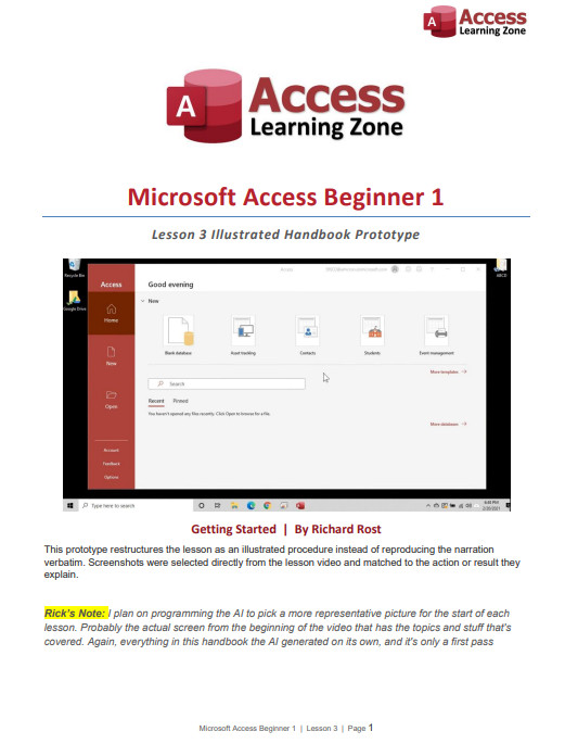
I wanted to give everyone a quick update about the course Handbooks, especially those of you waiting for Handbooks for the latest Access Developer lessons. A few of you have also politely reminding me that some of the newer lessons don't have Handbooks yet. I haven't forgotten about them. The delay is because I'm working on a much better way to produce them.
My old automated Handbook generator worked, but it was pretty basic. It took the lesson transcript, inserted a collection of screenshots from the video, and called it a day. The result was essentially a printed transcript with some pictures added.
My Handbook editors over the years, including Alex, Sami, and Sandra, have done fantastic work cleaning them up, replacing bad screenshots, adding missing images, and improving the formatting. However, that still requires a lot of time-consuming manual work. Someone has to watch the lesson, determine whether each screenshot is useful, find a better frame when it isn't, and place everything in the correct location.
Unfortunately, there are only so many hours in the day, and apparently Starfleet still hasn't delivered my requested army of holographic assistants. I've recently been working on a new proof-of-concept Handbook generator. My goal is to integrate it with my existing Microsoft Access database and video-production workflow.
The new system won't simply look for random scene changes and dump screenshots into a transcript. I want the AI to understand what I'm teaching, determine which steps actually need illustrations, and select the video frame that best demonstrates each action.
For example, if I say, "Click on this button," the Handbook shouldn't simply repeat those words. It should identify the button, include a screenshot showing where it is, draw a red box around it, and write something useful such as, "Click Current Database in the Access Options dialog."
The system can also add a short caption below each screenshot explaining exactly what the image demonstrates. Where appropriate, it can include a brief "Why This Matters" note that preserves the instructional reasoning from the video without copying everything I said word for word.
Moving forward, I want the course Handbooks to serve primarily as companions to the videos. They should provide a clear summary of the lesson, the important steps, useful explanations, and well-chosen screenshots showing exactly where to click.
In other words, you should be able to keep the Handbook open while watching the lesson and use it as a clean reference afterward. It shouldn't feel like you're merely reading a transcript of everything I said, including every "click here," "go over there," and occasional moment when my brain temporarily leaves spacedock.
Ideally, generating a Handbook will become another standard part of my production workflow. I finish recording and processing the lesson, click another button, and the system intelligently creates the Handbook. It may still need a quick human review, but I want to eliminate as much tedious manual cleanup as possible.
This is important to me, but it isn't my highest-priority project right now. I still have classes and other videos to produce, so I'm building the new generator during whatever spare development time I can find. I also don't want to rush it and start producing poor-quality Handbooks just to say they're finished. The screenshots need to show the correct controls, the red boxes need to highlight the right places, and the written instructions need to accurately reflect the lesson.
The sample I'm sharing today is only a proof of concept, but I think it demonstrates what this new format could become. Please take a look and let me know what you think. Do you prefer this cleaner video-companion format? Is there anything from the older Handbooks that you would miss? Would you like more explanation, more screenshots, or a different balance between the two? Your feedback will help determine how I develop the final format.
Once the companion Handbooks are working reliably, I would also like to expand the system to produce more comprehensive standalone books, similar to my Access Beginner 1 book on Amazon.
Those books would be different from the video Handbooks. They would contain more detailed explanations, examples, exercises, troubleshooting advice, and enough background to teach the material without requiring the videos. That is the longer-term goal. For now, I'm concentrating on making the course Handbooks smarter, clearer, more useful, and much easier to produce consistently.
Take a look at the sample and let me know what you think. If you guys like this direction, I'll continue developing it and eventually work my way through the missing Handbooks for the newer lessons. I might even start producing companion PDFs for TechHelp videos, too.
And keep in mind it's still just a rough proof of concept. I still have a lot of work to do on this before it's finished and polished.
I think Ricks note should be its own box like the Tip.
Maybe even with a picture of yourself with a speech bubble around it.
e.g. https://599cd.com/glossary/access/naming/
Sandra Truax
@Reply 5 days ago
I think it should make sure the text that goes with the picture is on the same page. Example: Text for Overlapping Windows is on bottom of 8, picture is on 9. I like that the pictures are AFTER the text.
Other than that, I think it is really looking good!
Sam Domino
@Reply 4 days ago
Some thoughts:
1) Maybe put page numbers after each "Lesson Map" bullet for quick reference.
2) I would use alphabetical for each subsection number (i.e. 2a, 2b, 2c, etc.)
3) If you use a "figure number" for each screen shot, you can then reference the figure on each step. This allows the user to quickly match "Figure 2b" with "Step 2b". Especially if "Step 2c" is on one page and "Figure 2c" is toward the bottom of the next page.
4) Maybe its just me, but the "highlight box" seems to fade into the background on some of the pictures. Maybe a different color or a gradient fill to make it stand out more.
5) Page 9's highlight uses 3rd person. I recommend always use 1st person to make it more personal.
6) Page 14 has a security notification. You may want to put a stop sign or warning sign graphic on the boxes showing anything dealing with security or actions you can't roll back.
7) On page 16, I would replace the "checklist" bullets with "check" boxes to give this list a more checklist feel.
8) I like to know my "Key Terms" at the beginning of a document.
Since the "system" is telling me this is "...getting pretty long", I'll take off my technical editor's hat and stop. LOL!!!
Oh no, no, no, Sam. Ignore that message. That warning is designed for people who decide to paste 8 million lines of code into a comment expecting us to troubleshoot it for them and find all their bugs.
If you've got good feedback to share, I don't care how long it is. Please, by all means, keep it coming. This is exactly what I need and exactly the kind of feedback I'm looking for.
Okay, I do realize it's early days w.r.t. this new Handbook project, and that my comments may not be particularly useful at this point (or at all helpful at any point), since I'm so new here.
But having gone through the lesson itself just a few days ago, I thought I might post. (Please feel free not to approve this post if you'd really prefer I hadn't!)
Anyway, disclaimers given, here are my thoughts on first read-through, in no particular order. Please take all with a large grain of salt.
General thoughts:
1) I like your ideas of what this new Handbook should be -- a lot.
2) I definitely appreciate the addition of the Tip/Important/More Info pink-backgrounded notes. They give the reader an opportunity to pause their study and give attention to something important that's been picked out of the main body of the material, and then perhaps motivate the reader to revisit the material to review the relevant parts more thoroughly. (One can only hope. It does that for me, anyway.)
3) I do prefer this cleaner format, it's easier to read.
Formatting thoughts (apologies in advance if any or all of these are premature):
1) I personally like having a "bookmarks" sidebar set up with a comprehensive table of contents. I've added them for my own ease of use to the PDFs that I've downloaded from your site so far. (I use CS6.)
2) It would be quicker for me to distinguish what's being "highlighted" by the red boxes in the images if those outlines were in a different hue family than red. (In this case, it's because there's so much in the image that's already in the red hue family, not because I dislike red. Or that the red shirt must die or anything.) I read on p. 12 that you might switch to blue. Cerulean might pop nicely. YMMV.
3) FWIW, and not all PDF readers will obey Properties (macOS's Preview, I'm looking at you), but for the benefit of the users of those readers that do (like me and mine, ha!), I like to set the Initial View properties to open with Bookmarks Panel and Page, Single Page layout, 100% Magnification, Open to page 1 (or to whichever page designation points to the cover), and Resize window to initial page. Again, YMMV.
4) Keeping in mind Sandra's excellent point w.r.t. keeping images and at least the first few lines of relevant body text on the same page AND directly above the image, maybe put a bit more space around and between some of the other objects, e.g. between page header and body text, between page header and image, between consecutive images, around the Tip/Important/More Info pink-backgrounded notes, etc.
5) Consider doing a special header for the first page, one that's minus your logo, since your logo appears again directly under the header on that page.
6) I have to admit that I prefer the footer in your original Beginner 1 Handbook -- I find it quicker to parse. But of course that's what I'm used to seeing in tech pubs, and I'm more than likely in a rut about that.
7) I'd like to see an "About the Author" page with your image, captioned with your name, along with maybe a short bio or abbreviated CV, just inside either the front or back cover pages, say.
Constance thank you for the wonderful feedback. It's after 1:00 am, and I'm bleary-eyed from staring at my screen all day, but I will address this soon.
Michael Duncan
@Reply 3 days ago
I agree with Sam the Rick's Notes box should use a background color like gray or yellow. Maybe even italicized. A picture of you is also a good idea.
Sorry, only students may add comments.
Click here for more
information on how you can set up an account.
If you are a Visitor, go ahead and post your reply as a
new comment, and we'll move it here for you
once it's approved. Be sure to use the same name and email address.