Free Lessons
Courses
Seminars
TechHelp
Fast Tips
Templates
Topic Index
Forum
ABCD
 
Home   Courses   TechHelp   Help   Contact   Merch   Join   Order   Logon   Forums   
 
Back to Access Forum    Comments List
Upload Images   @Reply   Bookmark    Link   Email   Next Unseen 
Access Form Design And Aesthetics
David Clement 
      
2 days ago
Good Afternoon Richard,
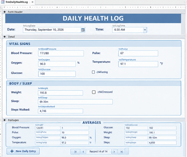
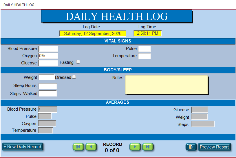
I have created a Wellness Log. I have been trying to make it look visually more appealing. Curiuosity got the best of me, so asked ChatGPT to show an AI example. Just a visual refference not how to do it.
I will show you what ChatGPT showed me and what I came up with.
Maybe you can show an exanple of how the ChatGPT was made. I don't think you would have made it that way shown.  
David Clement OP  @Reply  
      
2 days ago

David Clement OP  @Reply  
      
2 days ago

David Clement OP  @Reply  
      
2 days ago
First one=ChatGpt Suggestion
Kevin Yip  @Reply  
     
2 days ago
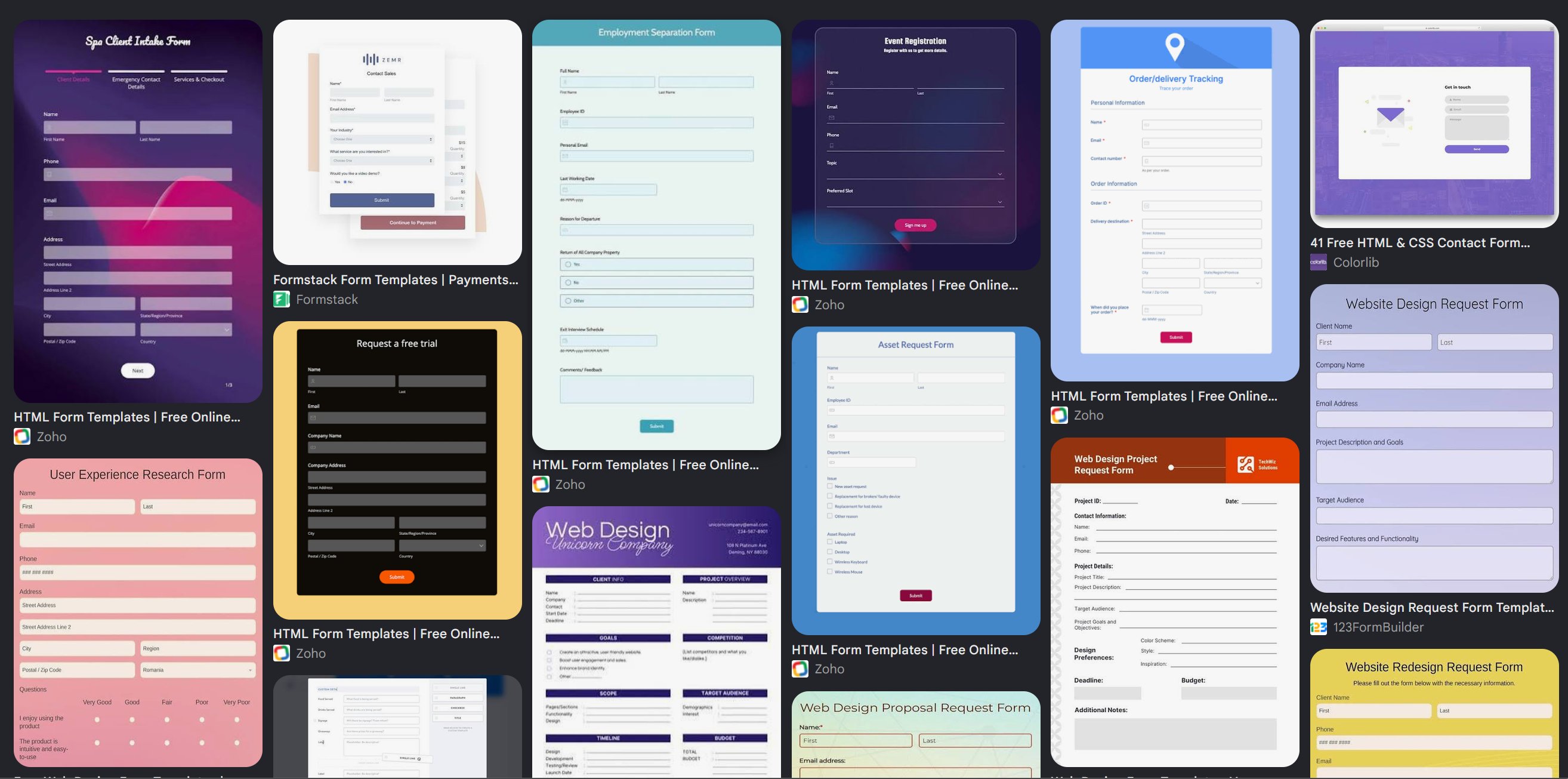
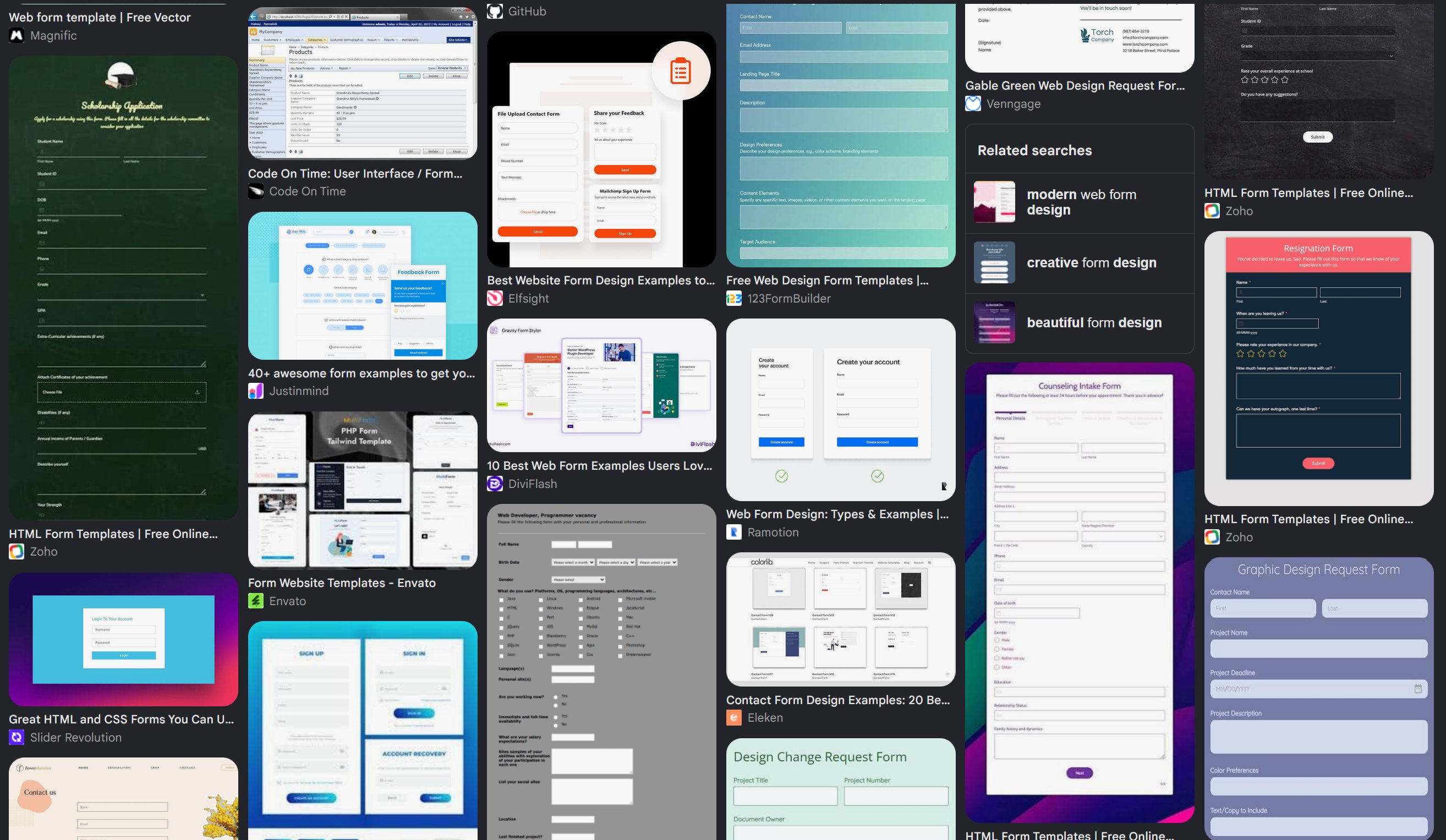
The AI output does not look better than yours, IMO; it looks like it was from the 90s -- sunken textboxes, raised buttons, common Arial font, etc.  If retro aesthetics were your thing, you might like it.  But by "visual appealing," I think you meant something more modern.  You can search "web form style templates" on Google and click Images to see some samples (pictured below).  The elements to consider are: form backgrounds, textbox style and color, button style and color, font style, etc.  As you can see from the samples, there can be any number of designs depending on "impressions" you want your users to feel: casual or business-like, "pleasant" to look at or striking, clean and sleek versus densely packed with controls, etc.
Kevin Yip  @Reply  
     
2 days ago

Kevin Yip  @Reply  
     
2 days ago

Kevin Yip  @Reply  
     
2 days ago
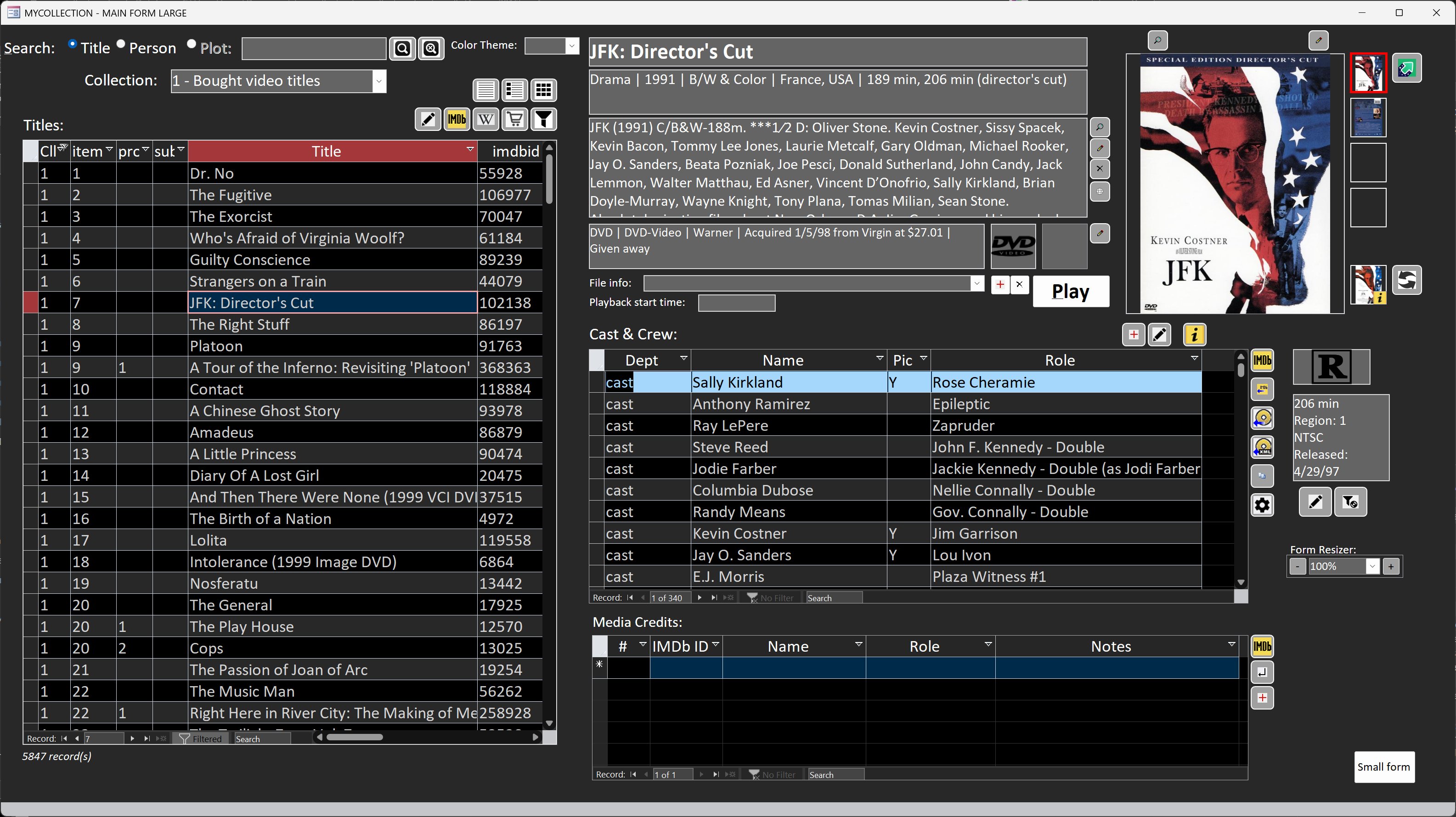
One of the most common form design schemes nowadays are dark theme or light theme.  Many software titles today have those built-in, such as Windows, Office, web browsers, smartphones, etc.

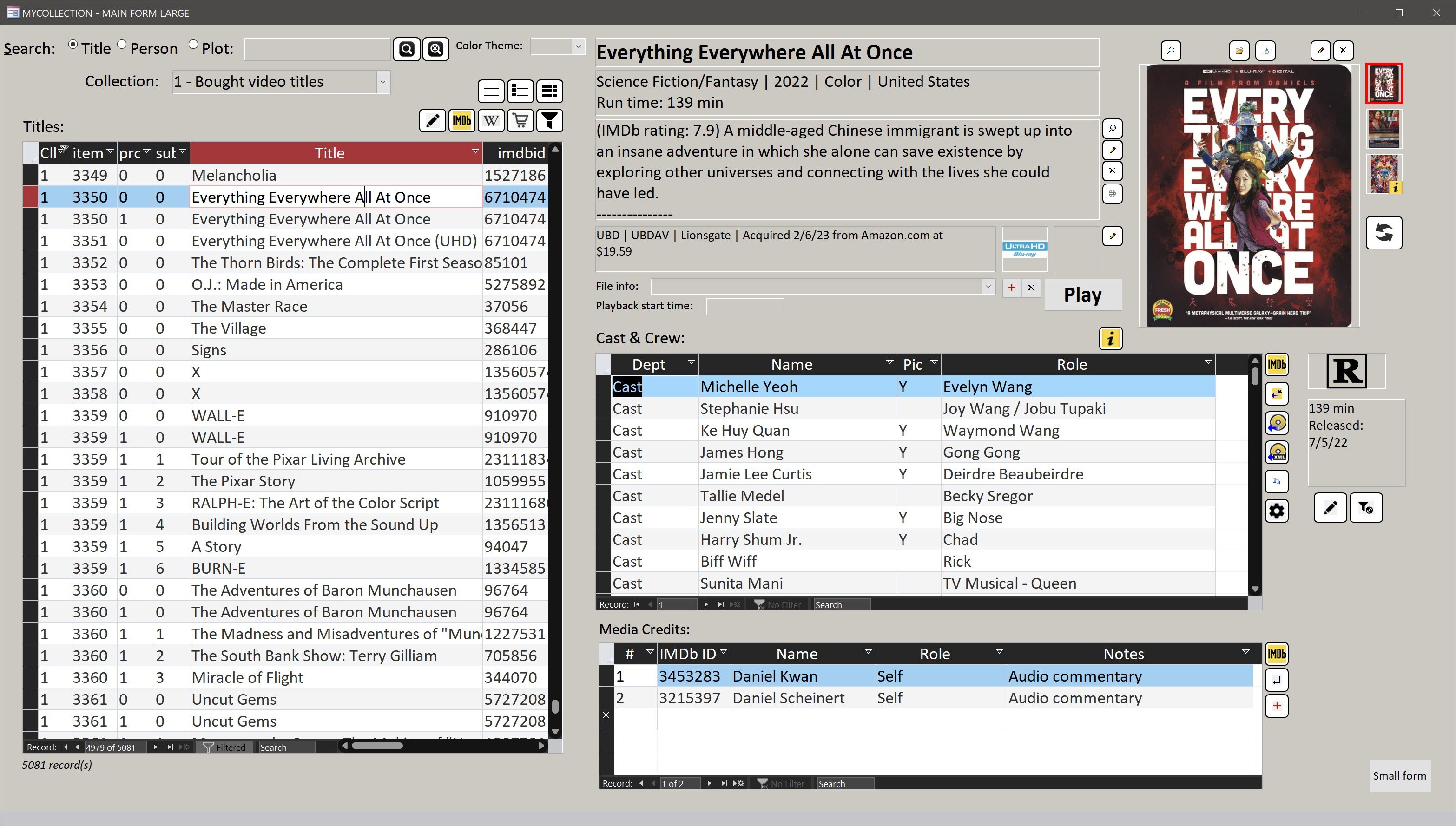
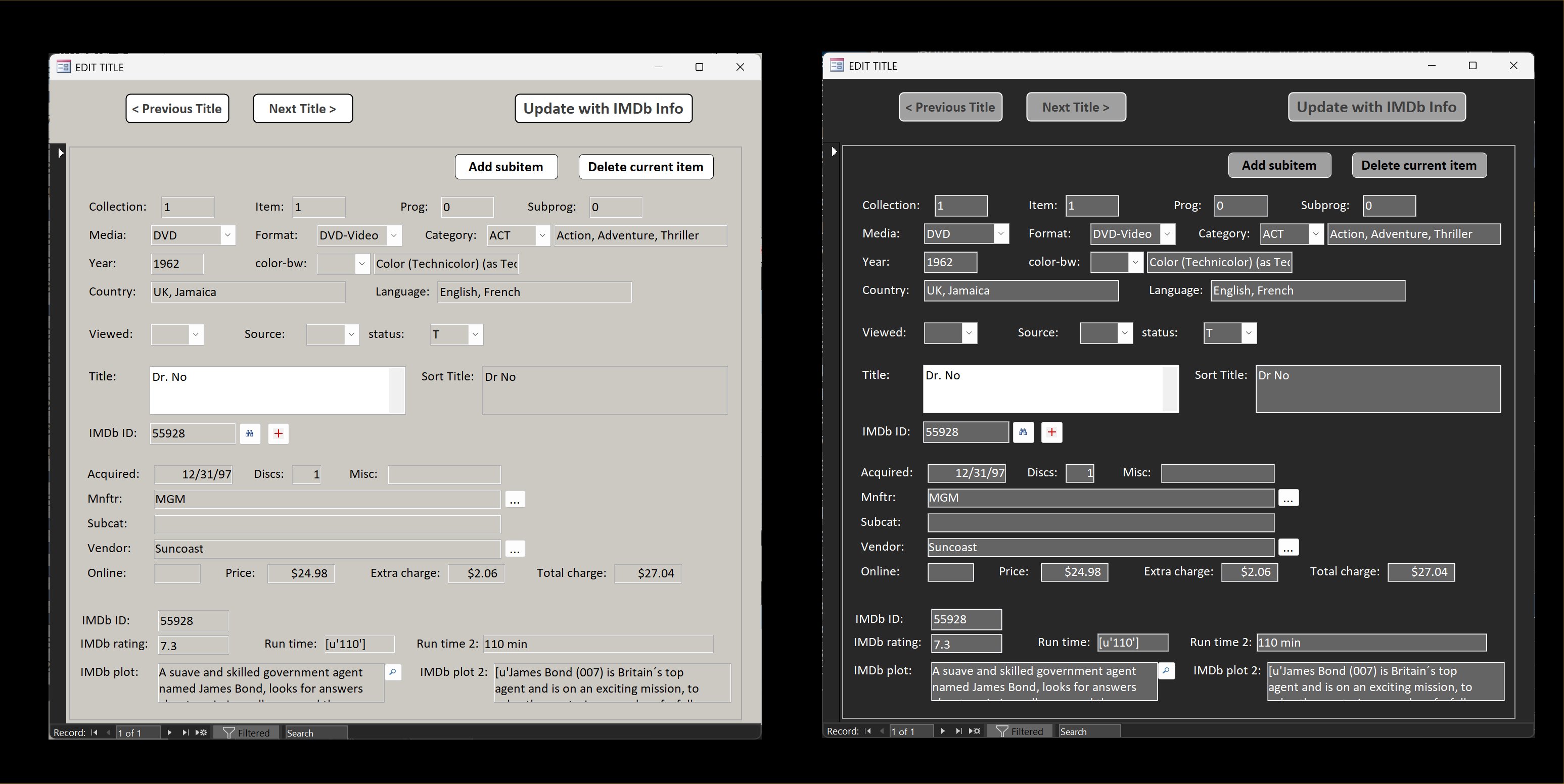
Below is a forms I made with selectable dark or light theme.
Kevin Yip  @Reply  
     
2 days ago

Kevin Yip  @Reply  
     
2 days ago

David Clement OP  @Reply  
      
2 days ago
I am just curious how to do the 3 different sections and the rounded corners. I don't think they are 3 different sub forms. I am quite sure there are videos on how to do this. As I said, I am mostly just curious. How was the Averages section done ___Averages__ or what ever.
David Clement OP  @Reply  
      
2 days ago
I really like your DVD Databse. I have trying to make my own database like yours but never could figure out how to do it using my exsisting database.
David Clement OP  @Reply  
      
2 days ago

David Clement OP  @Reply  
      
2 days ago
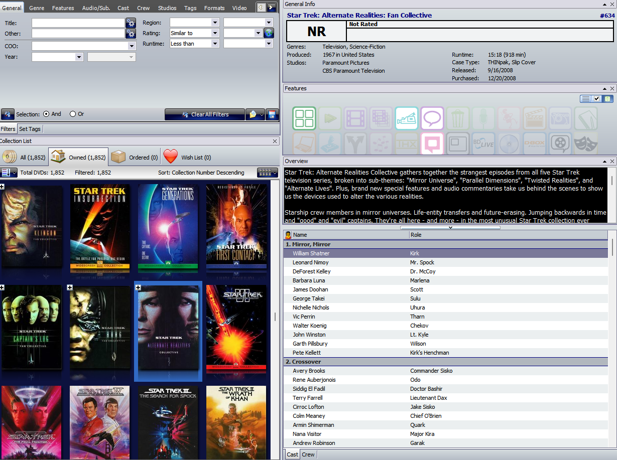
this what I use, but I didn't created it. I would like to make my own, but lack the expertise.
David Clement OP  @Reply  
      
2 days ago
The software does not have an export feature that access can use.
David Clement OP  @Reply  
      
2 days ago
Also, Envelos software is very old. 2017
Kevin Yip  @Reply  
     
2 days ago
David  

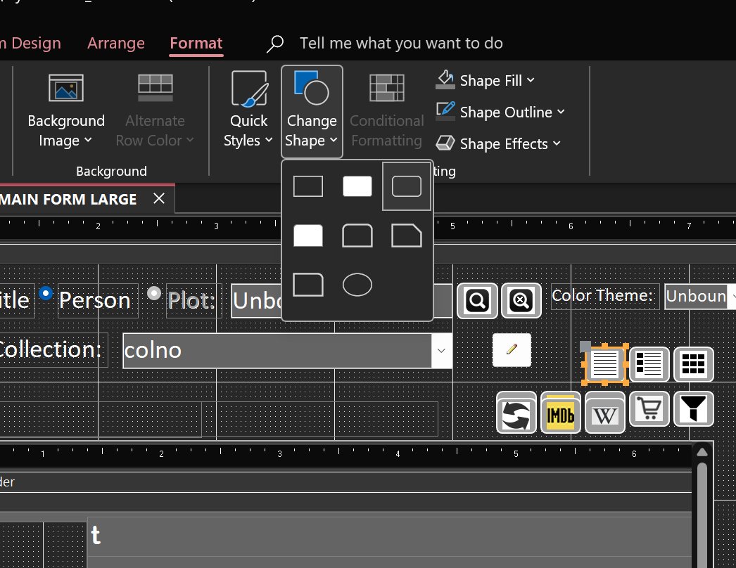
The round corners for buttons can be selected in Format -> Change Shape in design mode for the button (see picture below).

They are indeed just three subforms (in datasheet view), plus textboxes, picture boxes, etc., all regular built-in controls.

I still use Invelos DVD Profiler, but there are fewer and fewer contributors, as you would expect.  Eventually, when there no more contributors, or contributions that are timely, I'll have to enter everything manually.

DVD Profiler also lets you create custom media formats, not just DVDs or Blu-rays.  I use it to catalog my VHS tapes and laserdiscs as well, but I have to manually enter them, of course.

The database system used by DVD Profiler seems pretty efficient too.  Searching, scrolling, and filtering are fast, and the size of the data is only a fraction what would be used in SQL Server or Access.  The images are the only things that take up space.  I have no clue as to what type of database engine it uses.  When I export the data, it gives me XML data.
Kevin Yip  @Reply  
     
2 days ago

Kevin Yip  @Reply  
     
2 days ago
Another useful visual feature that I often use is giving a different background color to the textbox that the user is typing on (pictured below).  When a form has tons of textboxes and the cursor is only a tiny vertical line, the user may lose track of where he is on the form, especially after he looks away and looks back.  This can be done relatively easily by adding format conditions that check whether a particular textbox has the focus or not.
Kevin Yip  @Reply  
     
2 days ago

Richard Rost  @Reply  
          
25 hours ago
David, I think Kevin pretty much hit the nail on the head here. When it comes to making forms "look better," a lot of that is subjective. Personally, I don't think the form you already created looks bad at all. Once you've learned how to work with the standard Access controls, most of what you're seeing in the ChatGPT example is simply a matter of taking the time to arrange, size, color, and format those controls to get the look you want.

I've covered this specifically in my Aesthetics TechHelp video. That one discusses form design aesthetics, including spacing, color schemes, fonts, buttons, and generally making your forms more visually appealing. I also have Custom Form Backgrounds, which goes further into changing the overall appearance of a form, including custom title bars and background graphics.

I also cover more of this kind of formatting in Access Expert 4, including colored buttons and different-looking option groups.

As far as the three sections in the ChatGPT image are concerned, there's nothing particularly special going on there. They're basically just visually grouped areas with labels and controls arranged inside them. You can create that same general appearance with the tools Access already gives you. The "AVERAGES" heading, for example, doesn't require some special kind of control. It's just formatting and positioning to create that visual effect.

Rounded corners are a little different. As Kevin showed, you can already use Format > Change Shape for buttons. You can also fake various rounded effects with shapes if you really want to spend the time on it. However, I personally wouldn't put a huge amount of effort into working around Access's current limitations there because Microsoft has already shown upcoming rounded-corner support for Access controls. That was one of the UI improvements discussed at Access Day, so more of this is coming natively.

The biggest thing I'd stress is that there's no single "correct" modern form design. Kevin's examples demonstrate that nicely. You can make something dark, light, colorful, minimalist, densely packed, businesslike, or whatever suits the application. Once you know how to use labels, text boxes, buttons, images, colors, fonts, conditional formatting, subforms, and the other standard controls, the rest is mostly artistic design rather than additional Access technique. See also: Dark Mode

I could certainly do another TechHelp video showing how I would reproduce something like the ChatGPT example, and perhaps I will, but there really isn't any secret technique hiding behind it. Pretty much everything you're looking at can already be built using the tools I've covered in the classes and TechHelp videos. It's mostly a question of deciding what you want it to look like and then spending the time to make it look that way.
Kevin Yip  @Reply  
     
19 hours ago
Smartphones have been a major influence on how user interface in general is designed.  There is hardly any physical button on a smartphone anymore other than power and volume.  The touchscreen is flat, and so are all the "buttons" on the screen.  That's why raised buttons seem outdated nowadays.  Sunken textboxes would look odd too when everything else on the screen is flat.  So textboxes began to look flat as well.  A flat rectangle for a textbox would look boring, so round corners were born.
Add a Reply Upload an Image
Next Unseen


What's This?


The following is a paid advertisement
Computer Learning Zone is not responsible for any content shown or offers made by these ads.
 

Learn
 
Access - index
Excel - index
Word - index
Windows - index
PowerPoint - index
Photoshop - index
Visual Basic - index
ASP - index
Seminars
More...
Customers
 
Login
My Account
My Courses
Lost Password
Memberships
Student Databases
Change Email
Info
 
Latest News
New Releases
User Forums
Topic Glossary
Tips & Tricks
Search The Site
Code Vault
Collapse Menus
Help
 
Customer Support
Web Site Tour
FAQs
TechHelp
Consulting Services
About
 
Background
Testimonials
Jobs
Affiliate Program
Richard Rost
Free Lessons
Mailing List
PCResale.NET
Order
 
Video Tutorials
Handbooks
Memberships
Learning Connection
Idiot's Guide to Excel
Volume Discounts
Payment Info
Shipping
Terms of Sale
Contact
 
Contact Info
Support Policy
Mailing Address
Phone Number
Fax Number
Course Survey
Email Richard
[email protected]
Blog RSS Feed    YouTube Channel

LinkedIn
Copyright 2026 by Computer Learning Zone, Amicron, and Richard Rost. All Rights Reserved. Current Time: 9/14/2026 3:16:53 PM. PLT: 0s